Second and Seven Foundation Website Redesign
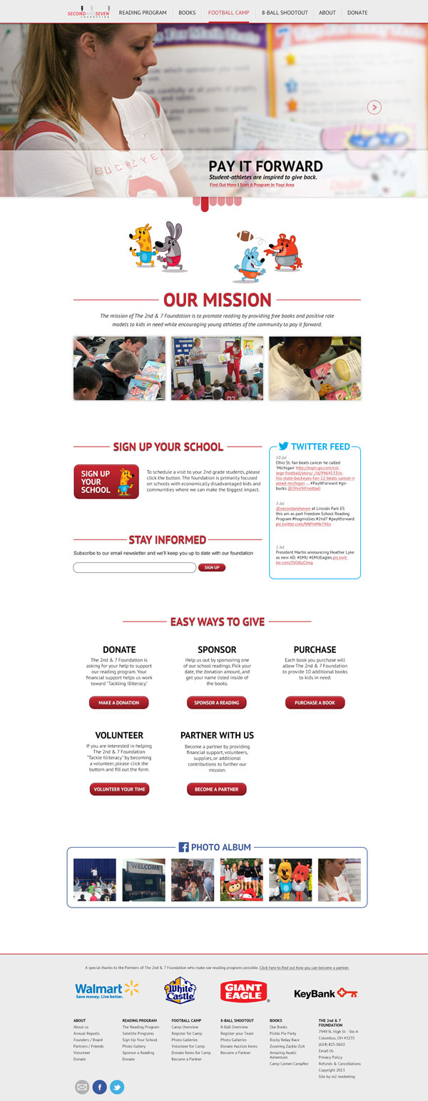
This site was made as a complete overhaul and redesign of the Second and Seven foundation's current site www.secondandseven.com. In order to make the site look entirely different and modern but still look like it belongs with the Second and Seven brand and books, color elements and characters were used throughout the design. The new design looks much more serious and professional, while still keeping users aware that the organization's main purpose is to help kids.

Final home page redesign.

Final home page redesign phone version.
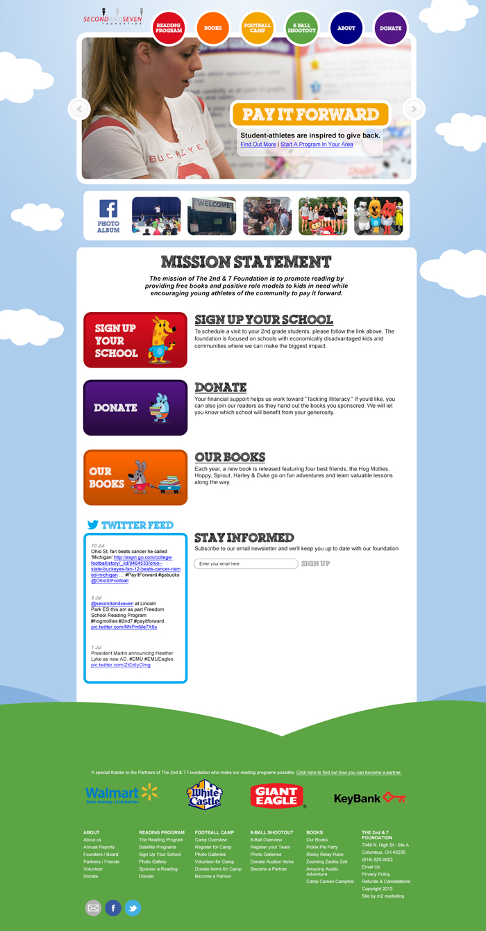
At first, I attempted to keep the current brand and look in the design. This however was not what was wanted, and so we moved on to redesigning it entirely.

Early version of the home page redesign similar to current branding.