Gathered Art Gallery Site Redesign
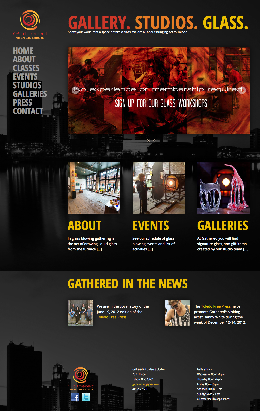
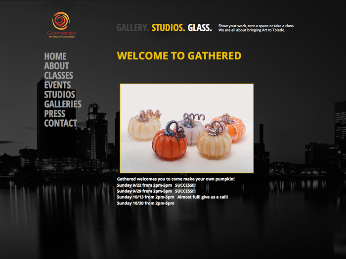
Gathered Art Gallery wanted their website design updated, but they liked a lot of the old site. Frankly, so did I. The full screen background image was cool, the logo is great, and the typography was just fine. However, it was easy to see what had to be done. The visual hierarchy didn't exist, and the current way the images were displayed was boring. After making some changes and additions to each page, the site looked extremely fresh and new while keeping the best aspects of the old site.

Final site after redesign.

Site before redesign.