Anderson Concrete Website Redesign and Development
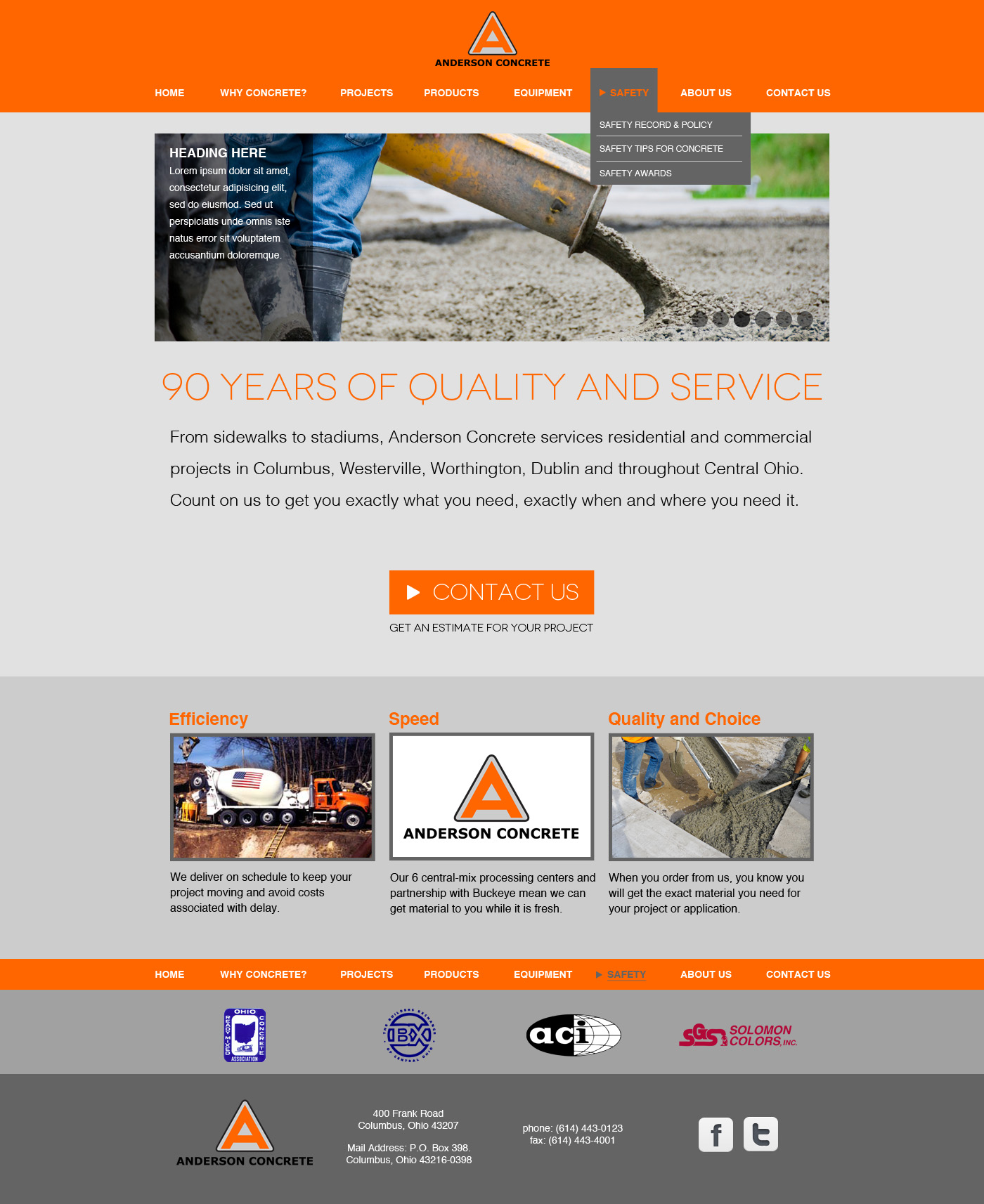
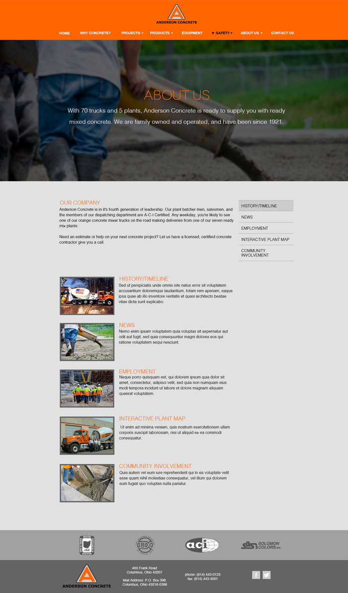
While interning at m2 Marketing, I was assigned to redesign the Anderson Concrete website. Researching similar companies showed a trend of rather dull, uninteresting, and outdated sites. In an effort to create a design to separate Anderson Concrete from the competition, I designed a simple, sleek, modern website not normally seen or expected by this type of company. Keeping the user in mind, I made sure that while it looked modern and sophisticated, it was simple and easy to use and navigate.

Final home page design.

About Us page design.

Phone desing of the home page.