Toxic Delights Logo Design
A good friend of mine contacted me and said that he was starting a band, and asked if I could make him a logo. I agreed, and he said his band was called "Toxic Delights" and that he had in mind a flower with the radiation sign in the middle. I absolutely loved the idea, and using it, I created this logo. A fun design contrasting the toxic and delightful elements, the logo can be separated to feature just the type or just the flower depending on the needs of any future applications.
The final logo design.
After finding a typeface that resembled caution and toxic signs and labels, I felt that more could and should be included to give it a delightfully toxic feel. My solution was to add a thick goopy radioactive waste to the word "TOXIC" seen on the final design.
In order to achieve this look, I used regular Elmer's glue and sqeezed huge globs onto the back of a notebook. Then I tilted the notebook to allow the glue to flow down and imitate what dripping, toxic radioactive waste might look like. The glue dried, and I was able to photograph it and increase the contrast in Photoshop to aid the vector tracing process. I repeated this a couple times until I got the look I wanted. I used the back of a notebook because it was sturdier and absorbed less of the glue.
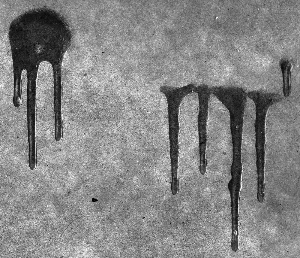
Glue dripped down a notebook and then photographed and edited to increase the contrast. It was the first step to creating the radioactive waste.
Next, I brought the photographed, high-contrast drips into Adobe Illustrator. Using custom live trace settings and some manual editing, I created realistic vector drips. I took bits and pieces of these traced drips and added them to the text to create the thick radioactive waste look.
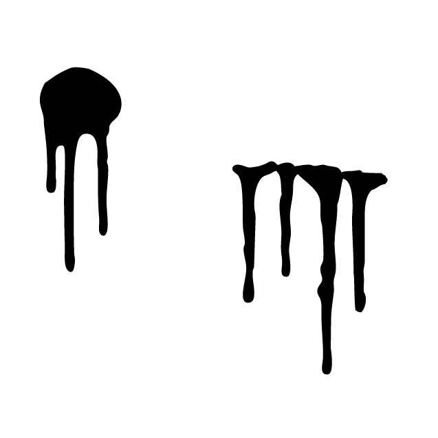
Vector trace made in Illustrator of the photographed drips.